


Role
UX / UI Designer
Timeline
2 weeks
Background
Señor Taquero is a restaurant based in San Diego, CA with a website in need of an update. For this concept project, I performed extensive analysis of the existing site along with conducting research as to how we might improve the site's usability.
Evaluating the Existing Site


Key Insights
Conducting the heuristic evaluation allowed me to create a list of requirements that the new design will need to resolve. As seen in my evaluation below, Señor Taquero was ranked at a high level of severity for usability among the following categories:
Visibility of system status
Match between the system and the real world
User control and freedom
Consistency and standards
Error prevention
Recognition rather than recall
Aesthetic and minimalist design
The heuristic evaluation made it clear that the usability of the site is preventing users from having an enjoyable and seamless experience when navigating the site. Also brought to our attention was the aesthetic design of the website and how iconography and branding need to be minimized and streamlined to allow for a clear understanding of the brand and website itself.


The heuristic evaluation helped to identify issues we would need to ensure were resolved in the new design and help us to better understand what may be causing customers to drop off the site. We discovered that the usability of the site is preventing users from having an enjoyable and seamless experience when navigating the site. Also brought to our attention was the aesthetic design of the website and how iconography and branding need to be minimized and streamlined to allow for clear understanding of the brand and website itself.
Affinity Map
Gathering the insights from the user interviews and usability tests within an affinity map helped to not only organize different perspectives and responses, but also made it clear what the common pain points were that the user faced.

Key Insights
The usability test and user interviews provided invaluable information as to what experiences the participants enjoyed within their preferred ordering site along with what pain points they experienced on Señor Taquero's website. Overall, Señor Taquero's website was difficult and frustrating for all participants to navigate, and was clear that an intensive redesign was needed.
noted their preferred meal order site as “easy to navigate” and “convenient”.
noted that they would not visit the Señor Taquero restaurant based on their website.
noted the homepage design feeling cluttered and expressed that the design should be improved
Conducting our user interviews gave us insight into commonly used products for online ordering. Analyzing these sites helped us to understand what features and information architecture is commonplace within restaurant and food ordering sites, and how this might be done successfully.

TJ Tacos
"At TJ Tacos, we’re all about real recipes and authentic taste.
Serving made-to-order, street-style tacos, we’re bringing you the best that Tijuana culinary tradition has to offer. In our quick and casual spot, everything is made fresh daily with quality ingredients."

Chipotle
"Clue is the period tracker and fertility app that puts the power of science and the support of fertility experts in your own hands."

The Taco Stand
"Natural Cycles is a hormone-free method of contraception that learns your unique cycle. The app identifies ovulation by analyzing your basal body temperature which you should measure when you wake up."
From analyzing the competitive research and comparing it with Señor Taquero's website, I then was able to gather insights and further identify opportunities for improvement.
100%
of the companies reviewed provided a map view of their location(s) to help the user navigate there and understand what location they were ordering from
100%
of the companies reviewed with multiple locations, the customer would need to select the location before starting an order to ensure that their store was open and available first.
100%
of the companies reviewed included pictures within their menu to allow the customer to understand what they were ordering.
POV Statement & HMW Question
Wrapping up all of the vital insights from user interviews, usability heuristics, and competitive research, I then developed point of view statements and how might we questions to pinpoint the problem and begin ideating how we might address it.
Point of View Statement
I’d like to explore ways to help hungry new customers easily place an order and navigate the Señor Taquero website because the outdated design and confusing layout is violating usability heuristics that cause the user to feel frustrated and lose interest.
How Might We… ?
How might we redesign the Señor Taquero website to provide ease of use for users and increase the restaurant's customers?
With the how might we statement defining the problem, I then began to expand on potential solutions by iterating a potential feature list.
Feature List
I began to develop key features that will be an important aspect of identifying what will be most impactful to implement into the website redesign to meet user and business goals.

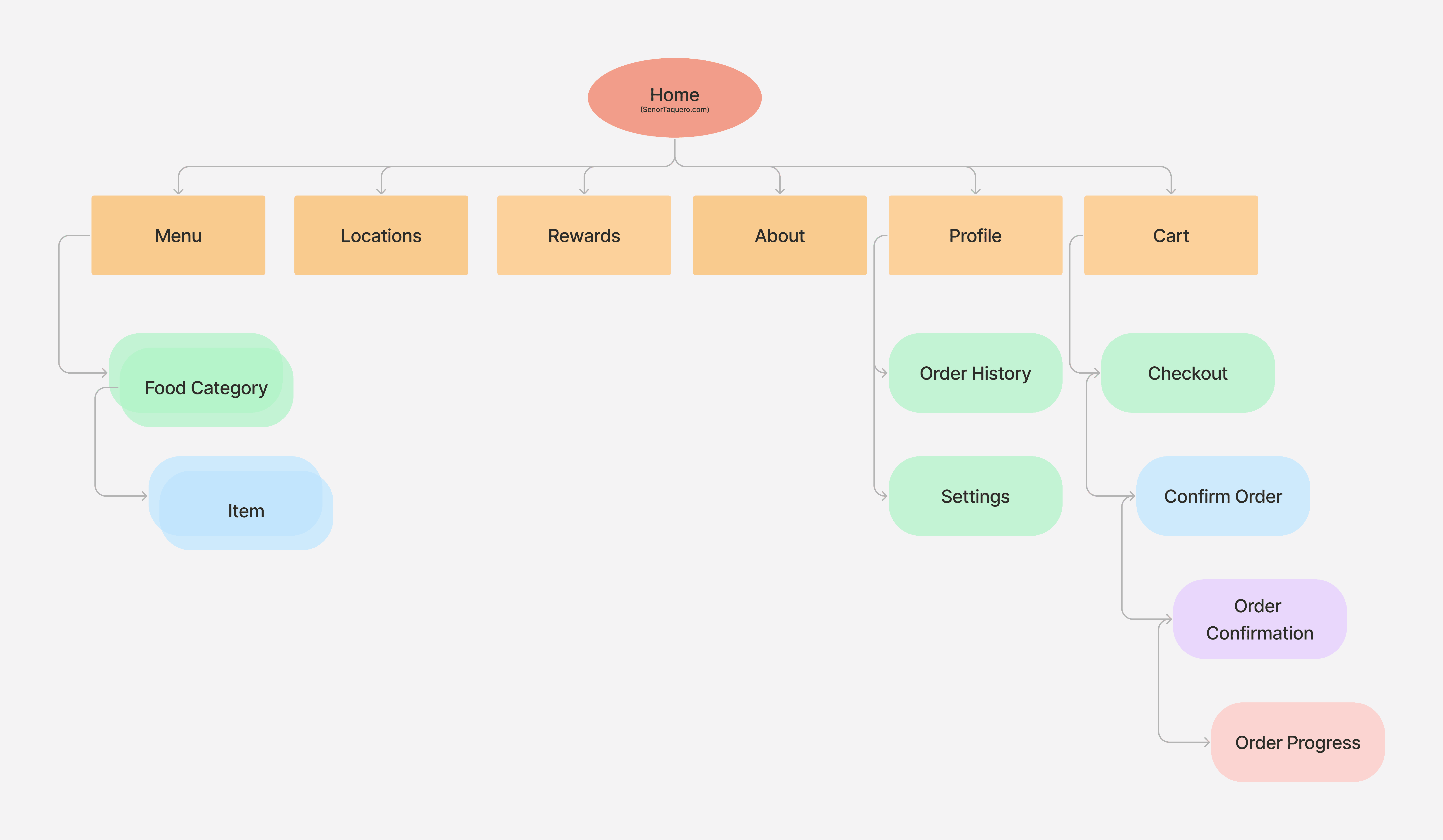
Site Map
Having a defined list of Key features allowed me to better understand the sites features and begin exploring how the information architecture might be structured. Looking back to the competitive research insights and usability heuristics helped to further guide the organization of content and features.
Existing Site Map

Proposed Site Map
User Flow
With the site map now defining the organization of the new site, User Flows were then developed to better understand the paths the user might take and what screens and actions need to be accounted for.

Conceptual Wireframes
Conceptual Wireframes
I began the process of designing the key screens defined in the user flows through a series of sketches.

Usability Testing
I then conducted usability tests with three users. The main testing goals were to identify pain points, determine if more or less content was needed, and assess whether the designs successfully addressed the users' key problems.
Tasks Users Completed:
1. Explore the Menu
2. Add Item to Cart
3. Place Pickup Order
Key Takeaways
Overall, the usability testing sessions gave us insights into what was currently successful within our design and where we could improve the usability further.
1
Participants' were able to navigate through the user flows with overall ease, and all tasks were successfully completed.
2
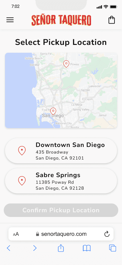
Participants noted they would prefer to select a location prior to choosing a meal item, which provided us insight as to how we should update our screen order with our user flow diagram.
3
Participants felt that there were screens within the checkout process that could be condensed to be faster to finalize the order.
Mid Fidelity Wireframes

Branding
With the brand's audience, goals, features, and information architecture having been developed, I then wanted to address the aesthetic and branding of the website. Throughout the user interviews participants noted how the website and branding felt outdated, overwhelming, and didn't allow them to understand the restaurant.
Updating iconography, branding, and the aesthetic of the site would be important not only to help tell the brand's story but also to ensure I was building a minimal site that was easy to understand and navigate.
I began by redesigning the logo to be simplified and easier for the user to read. The new logo and color scheme aims to encapsulate the in-person aesthetic the restaurant provides while still referencing the existing colors and values of Señor Taquero.
Previous Logo Design

Proposed Logo and UI Design

High Fidelity Wireframes

UI Kit
Throughout the process of finalizing the designs, I was also creating a User Interface Kit. Developing this element created consistency along with helping streamline the handoff process to a developer.
I developed and refined the UI Kit throughout the iterations and revisited constantly to ensure the kit was up to date and organized as needed.


HiFi Usability Tests
I conducted a final round of usability tests to find any remaining pain points or issues with our high fidelity wireframes before preparing to ship.
Usability Testing Insights

of participants noted they would be likely to order from the website, due to it’s ease of use, and reputable impression they were left with.
of participants were able to navigate through the user flows with overall ease, and all tasks were successfully completed.
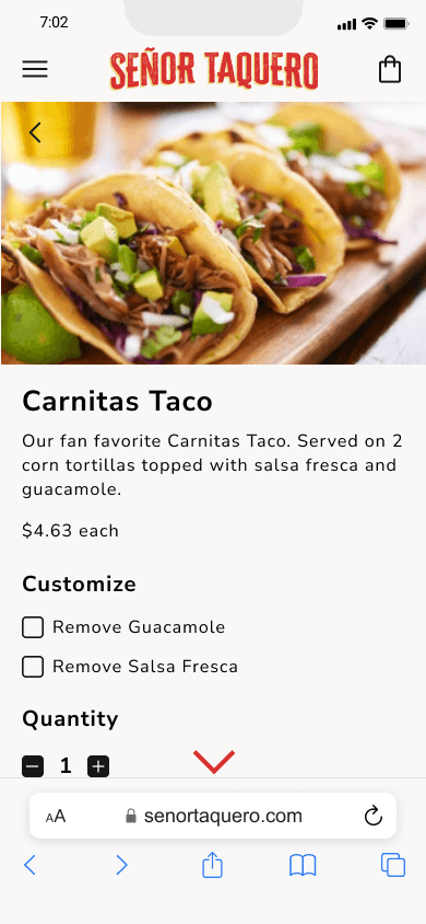
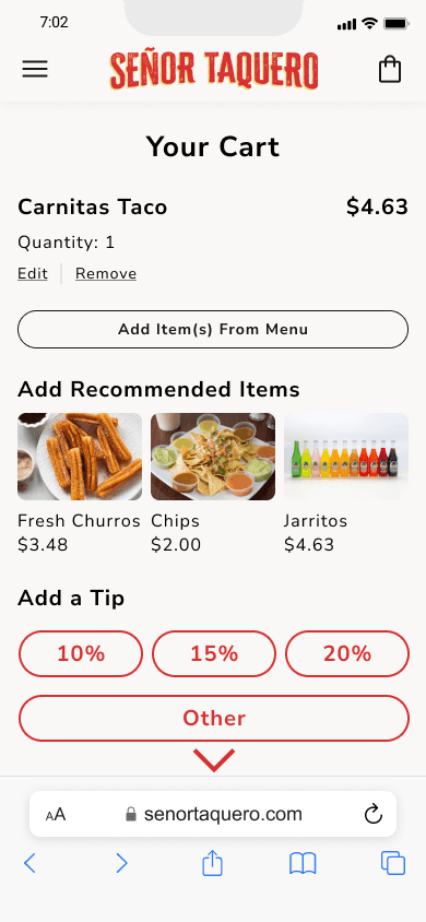
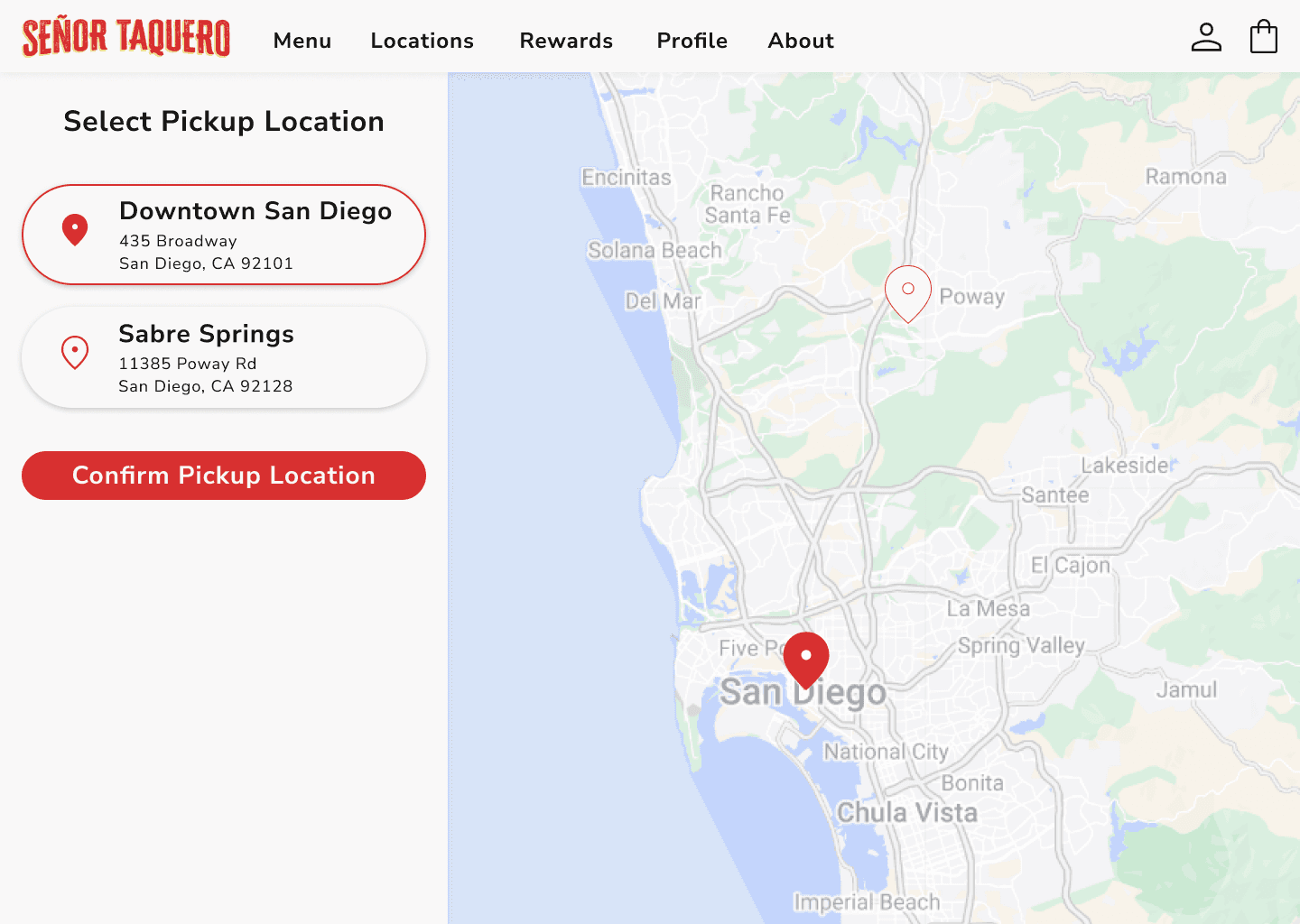
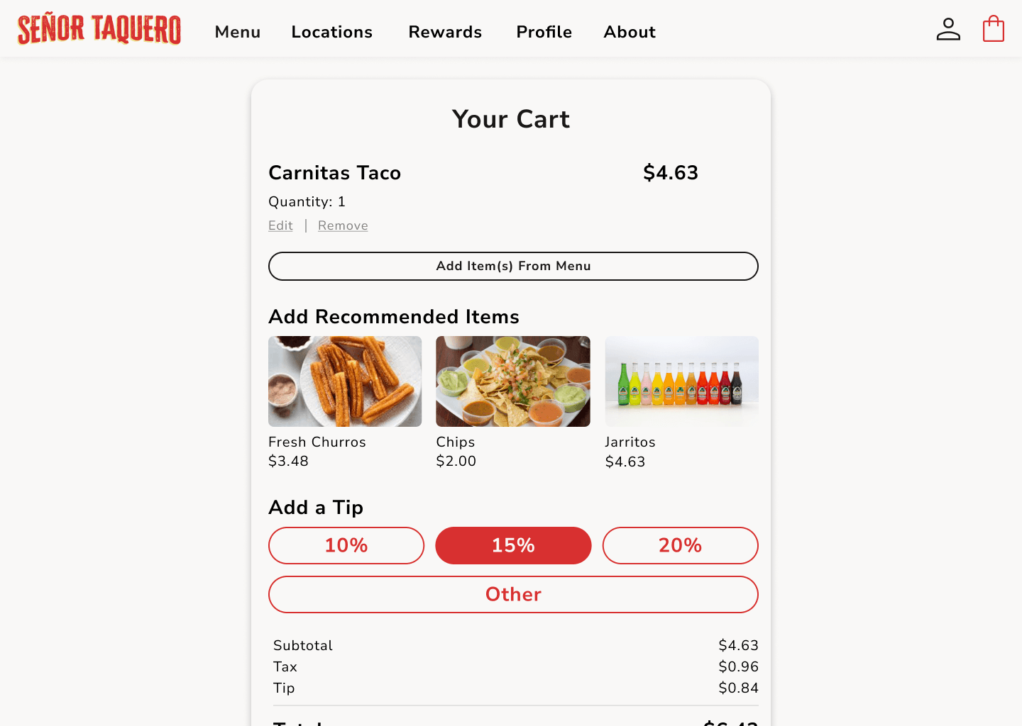
Validated Prototypes
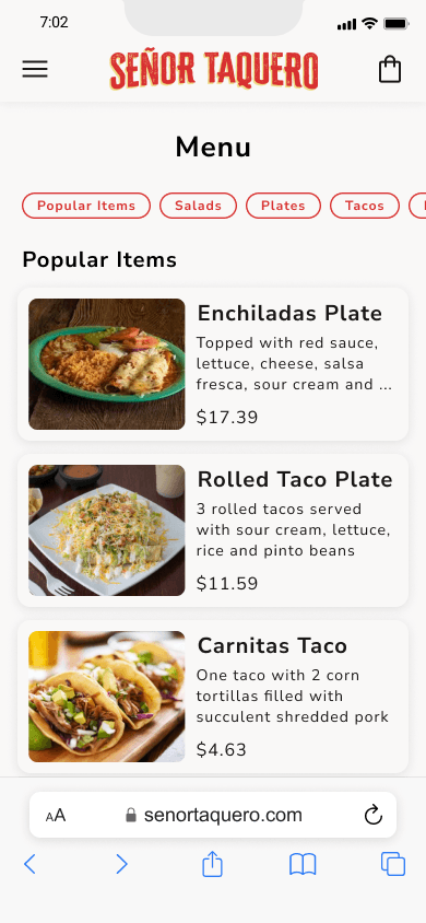
Before looking at the validated designs, I want to take a moment to reflect back on existing design. Looking back to what we were redesigning helps us to gain perspective on the impact every step has contributed to making on the overall user experience.
Before Redesign:
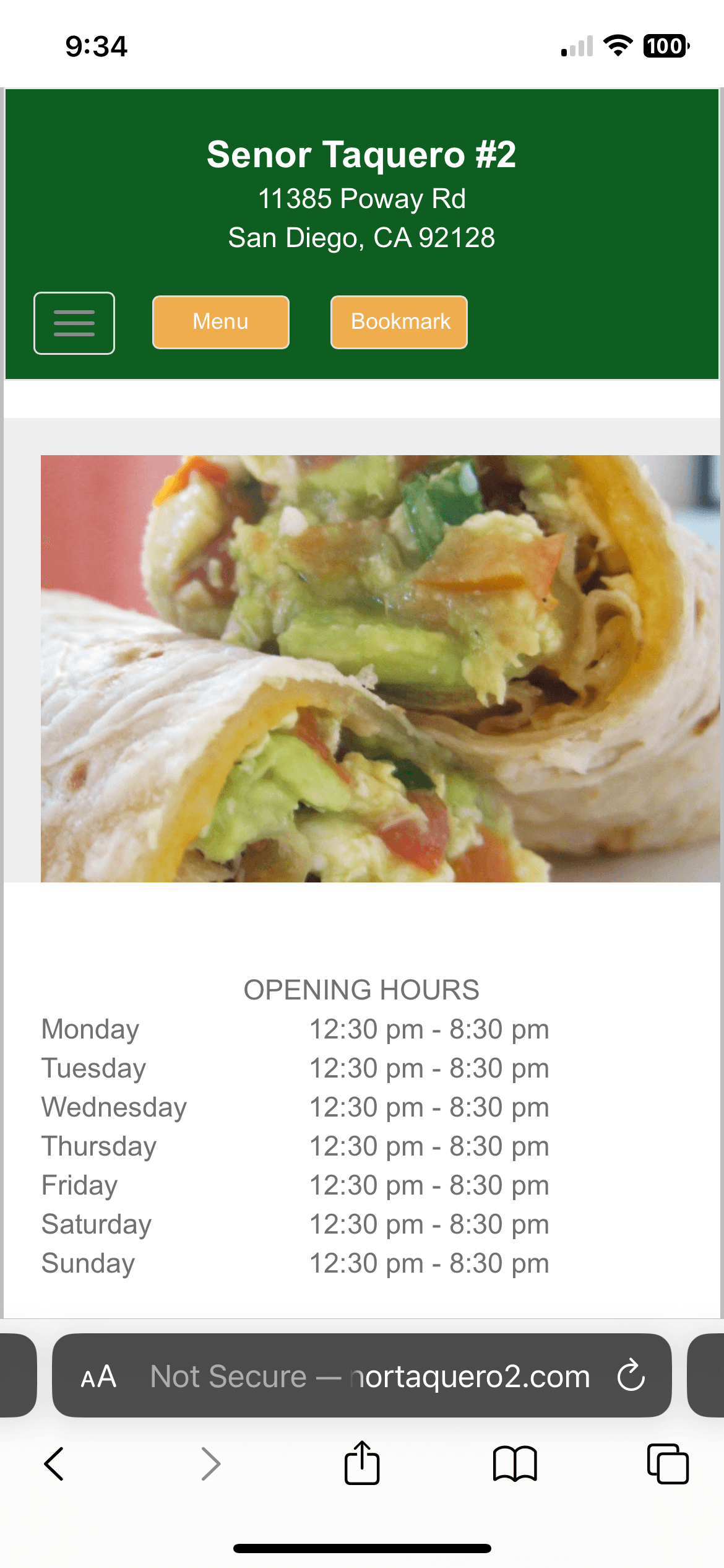
After Redesign:


Redesigning the Senor Taquero website helped strengthen my skills most notably in conducting usability tests and heuristic evaluations, as well as understanding the impact that rebranding can have on the overall user experience.
Since completing this project, my next steps are to discuss the project with a developer to refine the design and incorporate their feedback to streamline the design and user flow. From there, I am hoping to actualize the concept by reaching out to the business and seeing if they would be interested in upgrading their existing site.
Overall, I am incredibly proud of the responsive website redesign and was excited to see the product do amazing in the final round of usability testing.

View Project
